Pathology results delivery
A UI update and new features for a responsive customer-facing site.
Overview
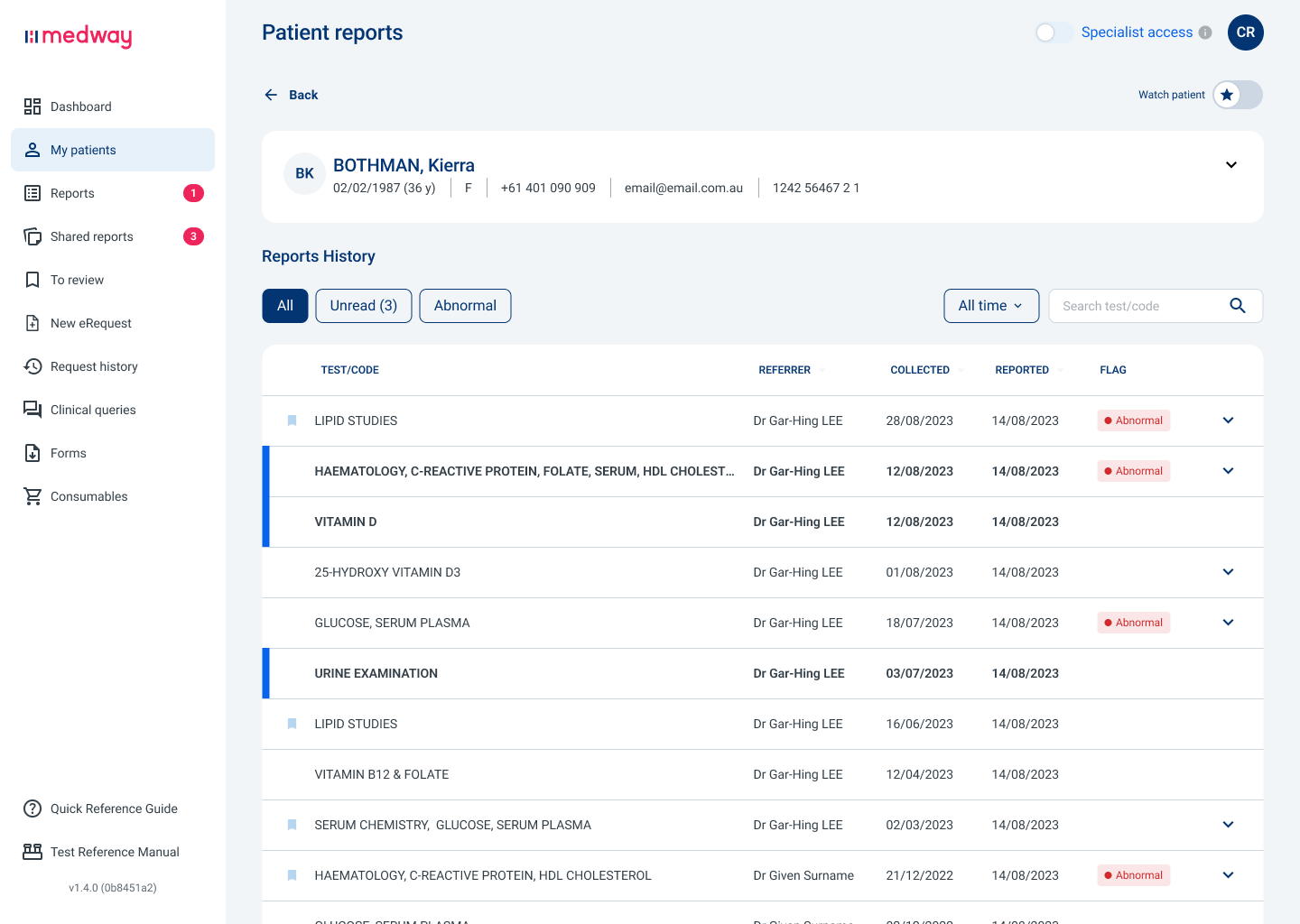
The ageing Medway pathology results platform was used by doctors, hospitals and clients across Australia to make more informed decisions and promote better health outcomes.
It required significant work on both back and front ends to keep pace with competitors and to continue to deliver value to users.
I was involved with the redesign of the existing interface as well as designing new features.
Background
Medway was suffering from multiple large databases, slow processing, an outdated UI and a limited feature set.
Its’ users varied from single practitioners, group practices, specialists, hospitals and private companies, each with their own unique requirements and issues.
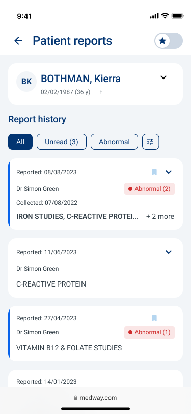
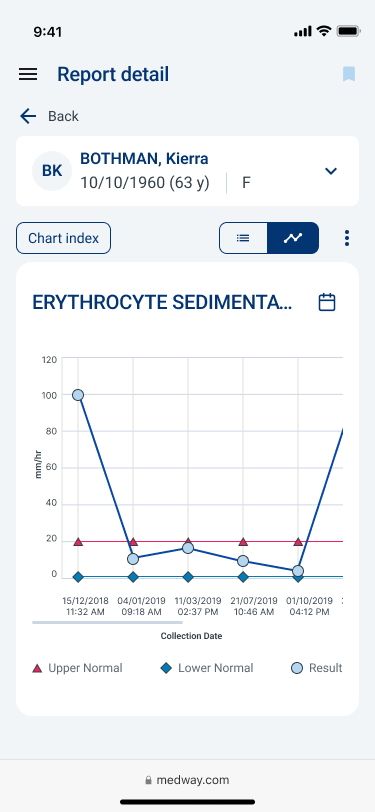
The platform needed to maintain consistency of function and experience from desktop to mobile devices as well as API and iframe services to medical practice management systems.
The challenge
The goals for the platform UI were :
Update the aged design.
Enable operation on a small mobile device (previously not enabled).
Open up the capacity for more features to be added.
My role
As product designer, I:
Conducted research (competitor and user)
Produced wireframes
Constructed prototypes (for design validation and promotion)
Created hi fidelity UI
Designed promotional material
Conducted design reviews based on user feedback
I worked on the project from its concept stage (September 2022), through the first two design update releases, an additional feature release and design of two further features (develoment commenced) to July 2024.
Constraints
Designs needed to retain some consistency in experience with existing API functions for users practice management systems.
The Medway user base did not have a large appetite for change and was comfortable with (sometimes preferred) large amounts of information crammed onto a single page.
A single development team was shared between 3 different platform design teams.
The process
Research
Internal research showed fragmented databases between individual state based business units that permitted different naming conventions, service offerings and standards used in results delivery.
Market and competitive analysis as well as customer feedback determined the platform was feature poor, slow and provided a substandard user experience.
Interviews with the full range of Medway’s users as well as internal SME’s and Business Development Managers confirmed the slow performance, aged interface, poor user experience and lack of features.
Indentify the user goals and main user flows used to achieve these
Design
My design duties included:
Take the initial concept developed by the design lead and build on these with wireframes in desktop, tablet and mobile formats
Develop new feature (2) concepts, user flows and wireframes
Construct desktop and mobile prototypes for the main user flows with the wireframes
Validate designs with user testing on wireframe prototypes
Produce high fidelity UI designs for development
QA the developed screens
Iterate on designs following post release feedback and analysis
Main design objectives and outcomes:
Continue the responsive website approach
Design the mobile experience in tandem with the desktop
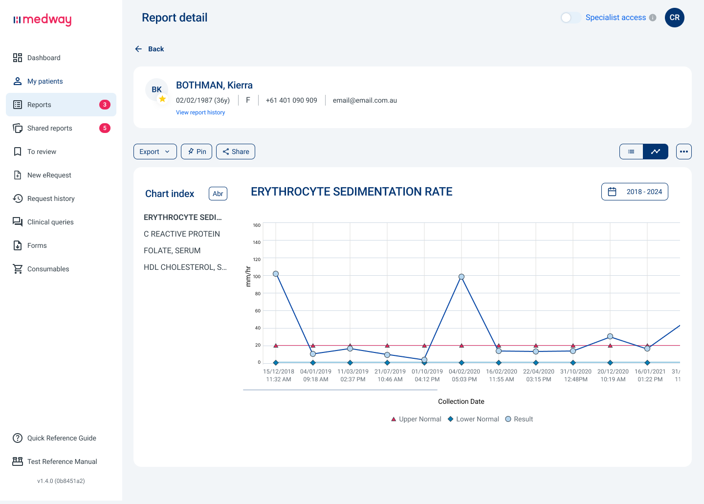
Update navigation layout to achieve consistency with mobile devices and expand the room for additional features
Leave the report format untouched (a larger project for the future)
New pages designed to group patient data and tests, facilitating test location via patient search
Expanding the search function into patient location as well as reports
All functionality of the desktop site was to be achievable on mobile as well.
New features
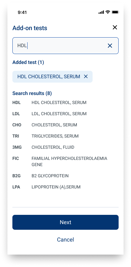
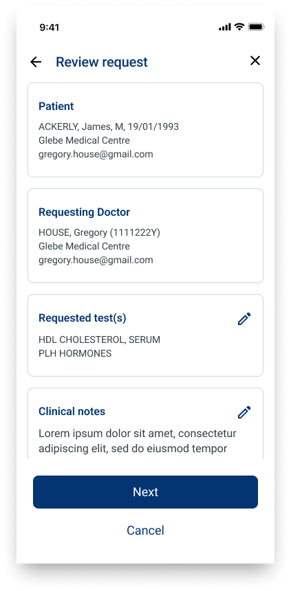
Developed the Add Test feature - introducing a two-way request/response flow to a previously one-way information consumption model.
Designed the Send to PMS feature - utilising API request to send a copy of a pathology report to a specific Practice Management System or fax number.
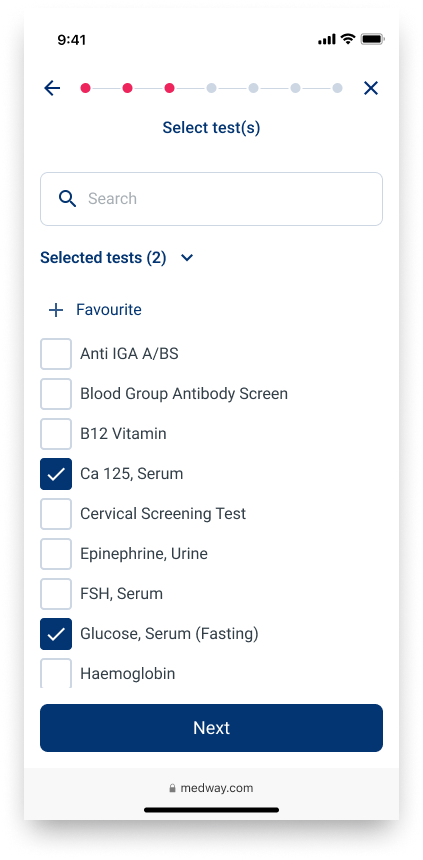
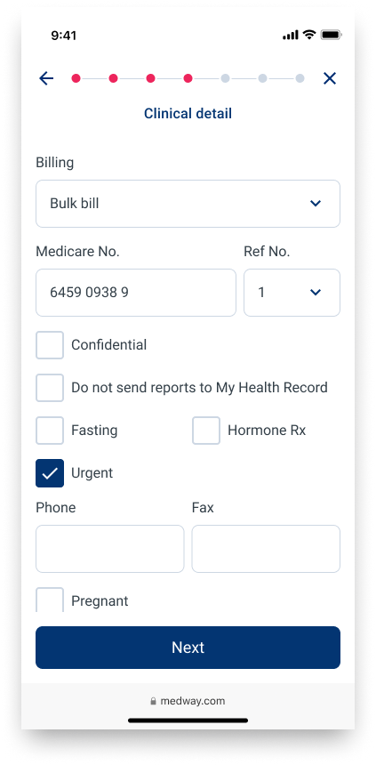
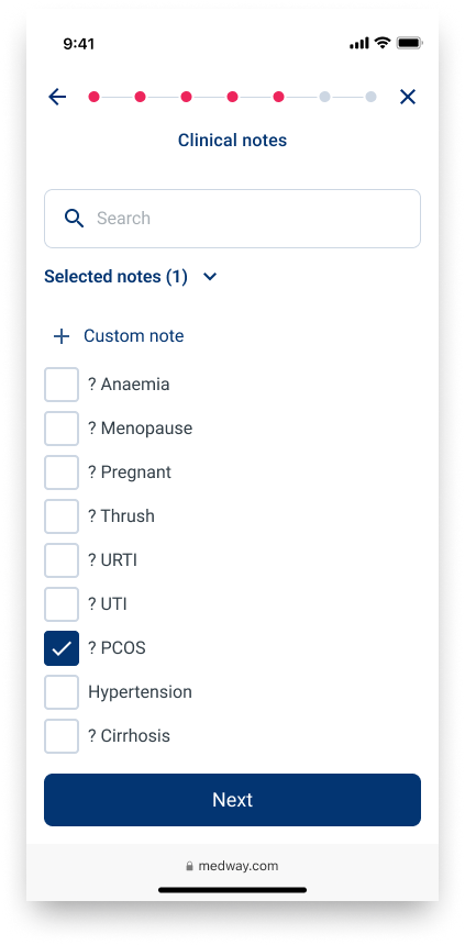
Designed the eRequest feature - enabling doctors to order pathology requests digitally and send referrals to patients via text message, integrating with existing paper based referral and collection procedures.
There’s always a catch…
Without coordination of existing design efforts, management instructed a consultant team to ‘superficially’ improve the existing UI via CSS changes that would also enable mobile use. This UI update would be squeezed into the first release, previously planned only for back end performance improvements.
Result: this release introduced a significant change to the UI that was not heading in the same direction as the prototyped and designed screens. With a user base that does not have a large appetite for change (feedback was fierce), we could not now perform a ‘big bang’ UI update and would have to let the dust settle before introducing further changes.
Our new objective was to drip feed elements of the new design into each upgrade and feature release while trying to maintain some sense of consistency between features and across screens.
Learnings
Technical input
Although desired, a growing team and changing processes meant tech input was not often available to review and provide input into the design process. This would have reduced rework after technical hurdles and barriers were uncovered.Unified approach
The unexpected change to the UI coupled to the improved performance release meant another major change to the UI should not be imposed upon users in the short term. Pivoting to incremental changes to gradually introduce the long term design goal presented additional work and pushed back our goal realisation.Design with prototyping in mind
I created 5 prototypes in total that covered wireframe user testing as well as high fidelity executive presentations. In many of these cases, the high fidelity designs required some rebuilding of components and layers to enable the desired user flows and interactions of a prototype. To reduce this additional work I should have included interactions when considering when a screen was complete.


